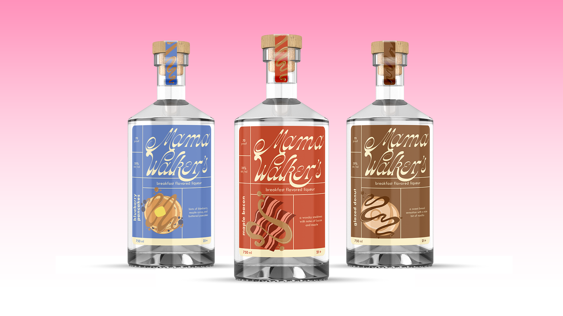
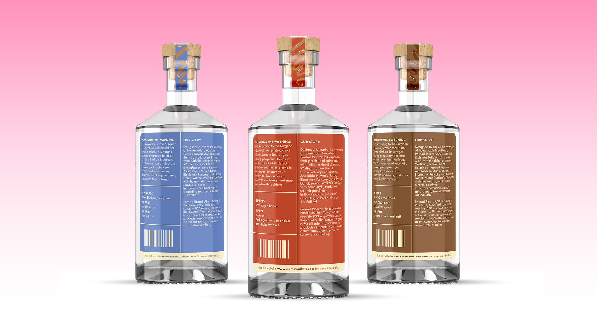
The purpose of this project was to make Mama Walker’s Liqueurs an appealing product that leaned in towards a feminine, outgoing audience. I began with a redesign of the company’s current logo, which was originally in a heavier, sans serif typeface. By using a swashy, playful typeface, I created a logotype that was more appealing and fit with my design goals. With the product’s overall aesthetic, I illustrated each flavor that included a swashy shape in each syrup. The illustrations also appear on the neck label, with the syrup taking more space on the longer strip. The color palette followed the same structure of being bright and colorful, while also being visually distinct. A simple sans serif typeface was used as well, with the different weights highlighting different pieces of information.
Logo Animation
In addition to the redesign, a logo animation was created. With the script logotype and nature of the product, I wanted the animation to feel fun and quick. The martini glass that spills the drink forms "Mama Walker's," returning back to the glass.